Visualising field using matplotlib#
There are several ways how a field can be visualised, using:
matplotlibk3dholoviewsvtk-based libraries, e.g.
pyvista
matplotlib provides two-dimensional plots of fields. This means that the field can be visualised only if it has two spatial dimensions.
Let us say we have a sample, which is a nanocylinder of diametre \(30\,\text{nm}\) and \(50 \,\text{nm}\) height. The value of the field at \((x, y, z)\) point is \((-cy, cx, cz)\), with \(c=10^{9}\). The norm of the field inside the cylinder is \(10^{6}\).
Let us firstly build that field. We start by creating a rectangular mesh which can contain the cylinder we described.
[1]:
import matplotlib.pyplot as plt

import discretisedfield as df

p1 = (-15e-9, -15e-9, -25e-9)
p2 = (15e-9, 15e-9, 25e-9)
cell = (1e-9, 1e-9, 1e-9)
mesh = df.Mesh(p1=p1, p2=p2, cell=cell)
Secondly, we want to define the norm. When we define the nanocylinder, the norm of the vector field outside the cylinder should be zero and inside \(M_\text{s}\). The Python function is
[2]:
def norm_fun(pos):
    x, y, z = pos
    if x**2 + y**2 < (15e-9) ** 2:
        return 1e6
    else:
        return 0
The Python function which defines the spatially varying field inside the cylinder is
[3]:
def value_fun(pos):
    x, y, z = pos
    c = 1e9
    return (-c * y, c * x, c * z)
Now, we can create the field.
[4]:
field = df.Field(mesh, nvdim=3, value=value_fun, norm=norm_fun, valid="norm")
vortex_field = field
Plotting using Field.mpl()#
The main function used to visualise the field using matplotlib is discertisedfield.Field.mpl. Let us try to run it.
[5]:
try:
    field.mpl()
except RuntimeError as e:
    print("Exception raised:", e)
Exception raised: Only fields on 2d meshes can be plotted with matplotlib, not field.mesh.region.ndim=3.
The exception was raised because matplotlib plotting is available only for two-dimensional planes. Therefore, we have to first intersect the field with a plane and then plot it. To select the plane we use function sel, let us intersect it with \(z=10\,\mathrm{nm}\) plane and then call the mpl method.
[6]:
field.sel(z=10e-9).mpl()

The figure is probably too small to see the interesting features of the field we defined. Therefore, we can make it larger by passing figsize argument.
[7]:
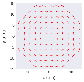
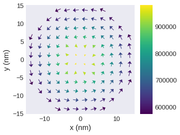
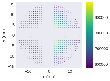
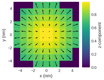
field.orientation.sel(z=10e-9).mpl(figsize=(15, 12))
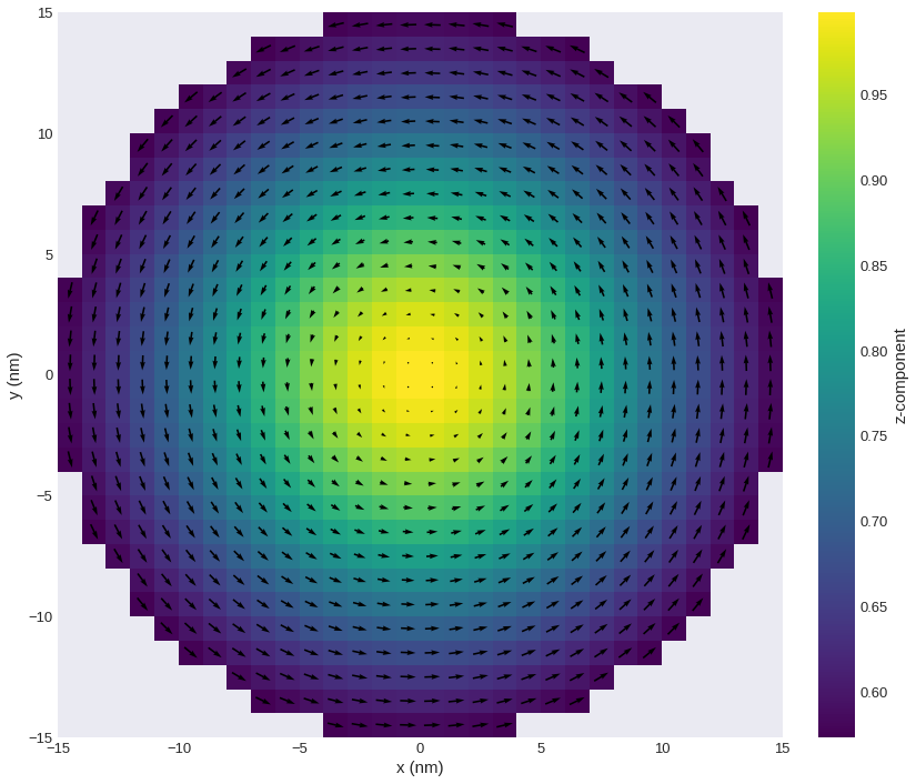
Now, we can see that we plotted the \(z\)-plane intersection by looking at the \(x\) and \(y\) dimensions on the horizontal and vertical axes, respectively. Secondly, we see that there are two overlapped plots: a coloured plot (scalar) and a vector plot (vector). vector plot can only plot two-dimensional vector fields. More precisely, it plots the projection of a vector on the plane we intersected the field with. However, we then lose the information about the
out-of-plane component of the vector field. Because of that, there is a scalar (scalar) field, together with a colorbar, whose colour depicts the \(z\) component of the field. We can also notice, that all discretisation cells where the norm of the field is zero, are not plotted.
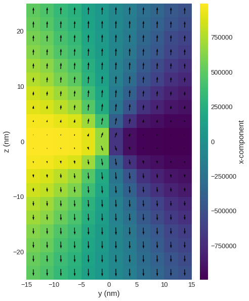
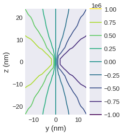
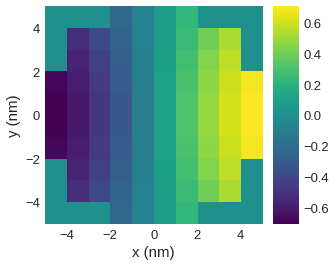
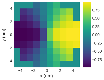
Similarly, we can plot a different plane
[8]:
field.sel("x").mpl(figsize=(10, 10))
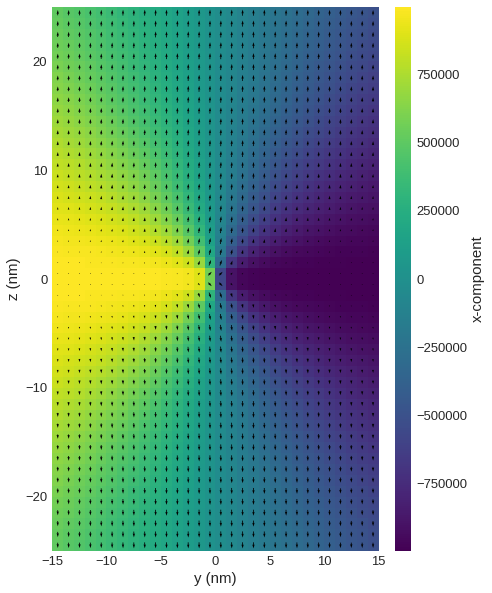
If there are too many discretisation cells on the plot, their number can decreased using resample.
[9]:
field.sel("x").resample(n=(12, 20)).mpl(figsize=(10, 10))
Available plotting functions#
So far, we showed the default behaviour of discretisedfield.Field.mpl(), a convenience function for simple plots. However, it is often required that a custom plot is built. Here, we show the different available plotting functions:
discretisedfield.Field.mpl.scalarfor plotting scalar fieldsdiscretisedfield.Field.mpl.vectorfor plotting vector fieldsdiscretisedfield.Field.mpl.contourfor plotting contour lines of scalar fieldsdiscretisedfield.Field.mpl.lightnessfor HSL plots of scalar or vector fields
discretisedfield.Field.mpl() internally combines discretisedfield.Field.mpl.scalar and discretisedfield.Field.mpl.vector.
In the following we will always plot the field on one of two different planes. To simplify the subsequent calls we first define the planes.
[10]:
plane_xy = field.sel(z=10e-9)
plane_yz = field.sel("x").resample((12, 20))
plane_xy.valid = True
Scalar field visualisation – mpl.scalar#
First, we simply try to plot the full field using mpl.scalar:
[11]:
try:
    plane_xy.mpl.scalar()
except RuntimeError as e:
    print("Exception raised:", e)
Exception raised: Cannot plot self.field.nvdim=3 field.
An exception was raised because mpl.scalar can only plot scalar fields. Therefore, we are going to extract the \(z\) component of the field.
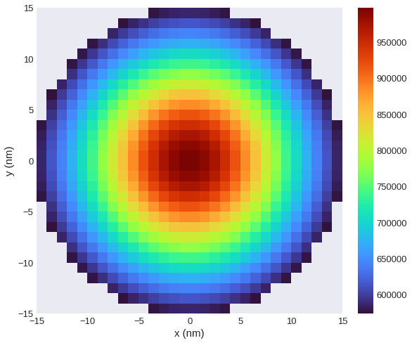
[12]:
plane_xy.z.mpl.scalar()
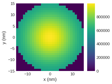
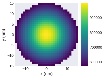
Now, we got a plot of the field’s \(z\) component. However, discretisation cells, which are outside the cylinder, are also plotted. This is because norm cannot be reconstructed from the scalar field passed to mpl.scalar. In order to remove the cells where field is zero from the plot, filter_field must be passed. The filter_field must be defined on a 2d mesh. In the current example the norm does not change along z direction so we can optionally omit the z position when
selecting a 2d layer.
[13]:
plane_xy.z.mpl.scalar(filter_field=field.norm.sel(z=10e-9))
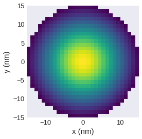
The colorbar is added to the plot by default. However, we can remove it from the plot.
[14]:
plane_xy.z.mpl.scalar(filter_field=field.norm.sel("z"), colorbar=False)
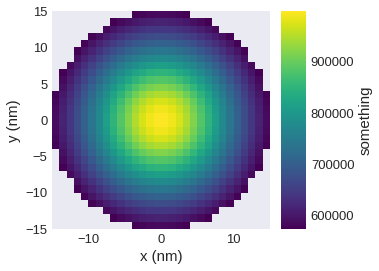
Similarly, we can change the colorbar label.
[15]:
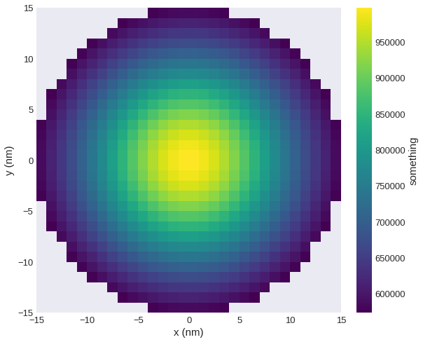
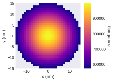
plane_xy.z.mpl.scalar(filter_field=field.norm.sel("z"), colorbar_label="something")
As already seen, we can change the size of the plot.
[16]:
plane_xy.z.mpl.scalar(
    figsize=(12, 8), filter_field=field.norm.sel("z"), colorbar_label="something"
)
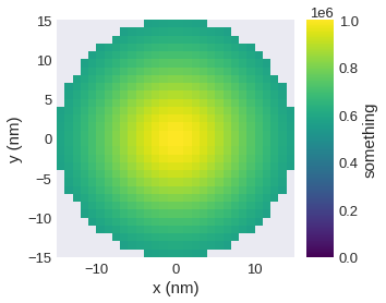
Sometimes it is necessary to adjust the limits on the colorbar:
[17]:
plane_xy.z.mpl.scalar(
    filter_field=field.norm.sel("z"), colorbar_label="something", clim=(0, 1e6)
)
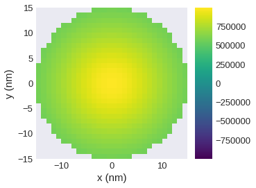
If we have data (symmetrically) arround zero it can be useful to have a symmetric colour bar, i.e. to asign the value zero to the central color. We can do this (without specifying limits manually) by passing symmetric_clim.
[18]:
plane_xy.z.mpl.scalar(filter_field=field.norm.sel("z"), symmetric_clim=True)
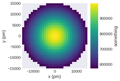
Multiplier used for axis labels is computed internally, but it can be explicitly changed using multiplier.
[19]:
plane_xy.z.mpl.scalar(
    filter_field=field.norm.sel("z"), colorbar_label="something", multiplier=1e-12
)
In order to save the plot, we pass filename and the plot is saved as PDF.
[20]:
plane_xy.z.mpl.scalar(
    filter_field=field.norm.sel("z"), colorbar_label="something", filename="scalar.pdf"
)

mpl_scalar is based on matplotlib.pyplot.imshow, so any argument accepted by it can be passed. For its functionality, please refer to the documentation. The available colormaps and additional information on the use of colormaps are shown in this matplotlib tutorial.
[21]:
plane_xy.z.mpl.scalar(
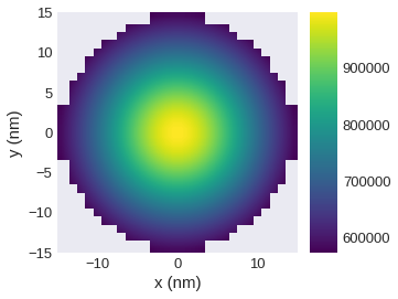
filter_field=field.norm.sel("z"), colorbar_label="something", cmap="plasma"
)
[22]:
plane_xy.z.mpl.scalar(filter_field=field.norm.sel("z"), interpolation="bilinear")
Vector field visualisation – mpl.vector#
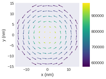
The default plot is:
[23]:
plane_xy.valid = "norm"
plane_xy.mpl.vector()

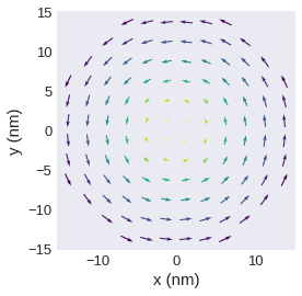
By default color is used to show the out-of-plane component. We can reduce the number of vectors.
[24]:
field.sel(z=10e-9).resample((12, 12)).mpl.vector()
We can turn of automatic coloring based on one vector component.
[25]:
field.sel(z=10e-9).resample(n=(12, 12)).mpl.vector(use_color=False)
Without automatic colouring, we can additionally specify a uniform color.
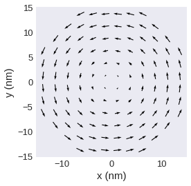
[26]:
field.sel(z=10e-9).resample((12, 12)).mpl.vector(color="red", use_color=False)
Turn of colorbar.
[27]:
field.sel(z=10e-9).resample((12, 12)).mpl.vector(colorbar=False)
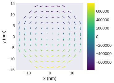
Use a different scalar field for coloring.
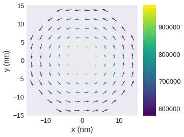
[28]:
field.sel(z=10e-9).resample((12, 12)).mpl.vector(color_field=field.x.sel(z=10e-9))
Similar to mpl.scalar we can
add a colourbar label,
change the colormap,
change the colormap limit,
change the multiplier,
change the figure size,
and save the plot.
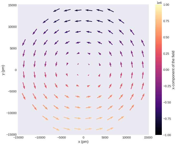
[29]:
field.sel(z=10e-9).resample(n=(12, 12)).mpl.vector(
    color_field=field.x.sel(z=10e-9),
    colorbar_label="x-component of the field",
    cmap="magma",
    clim=(-1e6, 1e6),
    multiplier=1e-12,
    figsize=(12, 10),
    filename="vector.pdf",
)
We can pass additional keyword arguments to change the quiver style (see matplotlib.pyplot.quiver documentation for details and available arguments).
[30]:
field.sel(z=10e-9).resample((12, 12)).mpl.vector(headwidth=8)
Scale of quivers.
[31]:
field.sel(z=10e-9).resample((12, 12)).mpl.vector(scale=1e7)
2d vector fields#
For 3d vector fields discretisedfield assumes that the first vector component points in spatial x direction, the second in spatial y direction, and the third in spatial z direction. For 2d vector fields we cannot automatically associate components and spatial directions. Therefore, we must explicitly define the components pointing in the plot x and plot y direction by passing vdims.
We first create a 2d vector field and assign new component names.
[32]:
plane_2d = plane_xy.x << plane_xy.y
plane_2d.vdims = ["a", "b"]
plane_2d.vdim_mapping = {"a": "x", "b": "y"}
[33]:
plane_2d.mpl.vector()
/tmp/ipykernel_24169/2267308248.py:1: UserWarning: Automatic coloring is only supported for 3d fields. Ignoring "use_color=True".
  plane_2d.mpl.vector()
First, we assume that the first component a would point in spatial x direction and the second in spatial y direction.
[34]:
plane_2d.mpl.vector(vdims=["a", "b"])
/tmp/ipykernel_24169/1144442250.py:1: UserWarning: Automatic coloring is only supported for 3d fields. Ignoring "use_color=True".
  plane_2d.mpl.vector(vdims=["a", "b"])

Now, we assume that component a points in spatial y direction and component b in spatial z direction. Furthermore, we assume that the field has no component in spatial x direction. Here, we plot an xy plane and hence can only see the y component. We can get such a plot by passing None as first argument of vdims:
[35]:
plane_2d.mpl.vector(vdims=[None, "a"])
/tmp/ipykernel_24169/2107426239.py:1: UserWarning: Automatic coloring is only supported for 3d fields. Ignoring "use_color=True".
  plane_2d.mpl.vector(vdims=[None, "a"])

Similarly, we could assume that a points in x and b in z direction and we don’t have a component in y direction:
[36]:
plane_2d.mpl.vector(vdims=["a", None])
/tmp/ipykernel_24169/4138781858.py:1: UserWarning: Automatic coloring is only supported for 3d fields. Ignoring "use_color=True".
  plane_2d.mpl.vector(vdims=["a", None])
We can also pass vdims to a 3d vector plot. Here, we swap the first and second component to demonstrate the behaviour. Note, that now the vector x component points in spatial y direction and the vector y component points in spatial x direction which does not make much sense.
[37]:
plane_xy.mpl.vector(vdims=["y", "x"])
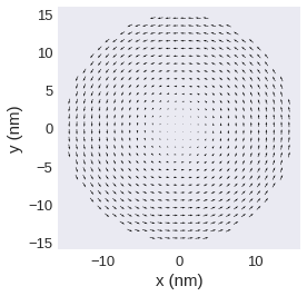
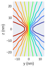
Contour line plots – mpl.contour#
Scalar fields can be plotted as contour line plots.
[38]:
plane_yz.x.mpl.contour()
Similar to mpl.scalar it is possible to
change the
figsizespecify a
multiplierspecify a
filter_fieldsave the figure by passing
filenamecontrol
colorbarandcolorbar_label.
Additional keyword arguments can be passed, as mpl.contour is based on matplotlib.pyplot.contour (documentation).
[39]:
plane_yz.x.mpl.contour(levels=15, cmap="turbo", colorbar=False, linewidths=3)
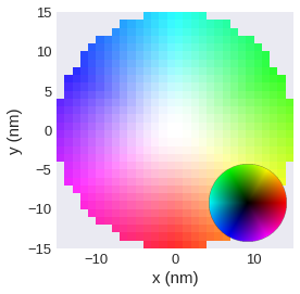
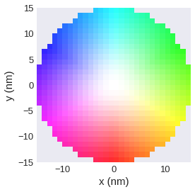
HSL plots – mpl.lightness#
A common way to plot full vector fields is to use the HSV/HSL color scheme. The angle of the in-plane component is then shown by colour, the out-of-plane component by the lightness.
mpl.lighness can be used for fields with dim=1, dim=2, or dim=3. For dim=3 vector fields the out-of-plane component is used for the lightness, otherwise the norm is used by default. If no filter_field is specified, the norm is used as filter field by default.
[40]:
plane_xy.mpl.lightness()
Similar to mpl.scalar it is possible to
change the
figsizespecify a
multiplierspecify a
filter_fieldsave the figure by passing
filename.
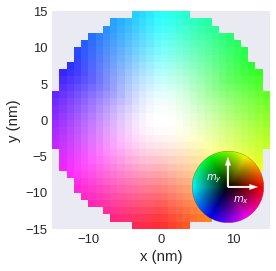
Instead of a colorbar a colorwheel is shown by default. It is possible to show additional labels.
[41]:
plane_xy.mpl.lightness(colorwheel_xlabel=r"$m_x$", colorwheel_ylabel=r"$m_y$")
Not showing the colorwheel.
[42]:
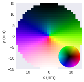
plane_xy.mpl.lightness(colorwheel=False)
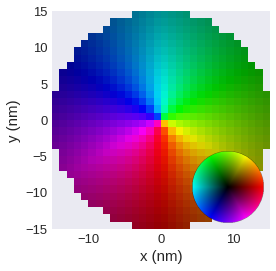
Specifying a different lighness_field.
[43]:
plane_xy.mpl.lightness(lightness_field=field.x.sel(z=10e-9))
Change the lightness range.
[44]:
plane_xy.mpl.lightness(clim=(0, 0.5))
colorwheel#
We can pass additional keyword arguments to colorwheel_args in the lighness plot.
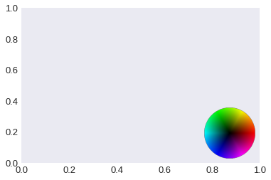
To get more control over the colorwheel the function to draw the colorwheel is exposed an can be used separatly. We have to explicitly give an axis to add_colorwheel.
[45]:
fig, ax = plt.subplots()
df.plotting.mpl_field.add_colorwheel(ax=ax)
[45]:
<AxesHostAxes: >
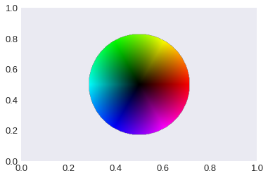
We can specify widht, height, loc and additional keyword arguments that can be used for mpl_toolkits.axes_grid1.inset_locator.inset_axes (documentation).
[46]:
fig, ax = plt.subplots()
df.plotting.mpl_field.add_colorwheel(ax, width=2, height=2, loc="center")
[46]:
<AxesHostAxes: >
Combining scalar and vector plots – mpl()#
In the beginning, we have briefly seen, that we can use the convenience function mpl() to generate plots. We can adjust these plots by passing scalar_kw or vector_kw that are internally passed to mpl.scalar and mpl.vector, respectivly. All arguments allowed for mpl.scalar or mpl.vector can be specified. By default use_color=False for the quiver plot. To disable automatic filtering add scalar_kw={'filter_field': None}.
[47]:
plane_xy.mpl(
    figsize=(12, 8),
    scalar_kw={"cmap": "turbo"},
    vector_kw={
        "cmap": "cividis",
        "use_color": True,
        "color_field": field.x.sel("z"),
        "colorbar": True,
        "colorbar_label": "x-component",
    },
    multiplier=1e-9,
)
If we have a 2d field and want to use mpl we have to always pass vdims to vector_kw.
[48]:
plane_2d.mpl(vector_kw={"vdims": ["a", "b"]})

Building a custom plot#
We can build custom plots by combining the different available plots. This is done via passing axes to the plotting functions. In the following we start with a step-by-step example and then show some additional examples.
First, we manually create the combined scalar-vector plot similar to the one show in the cell above. We start by creating figure and axes.
[49]:
fig, ax = plt.subplots(figsize=(12, 8))
Then we can add the scalar plot of the z-component and pass ax as additional argument. We have to manually specify the filter_field.
[50]:
fig, ax = plt.subplots(figsize=(12, 8))
field.sel(z=10e-9).z.mpl.scalar(ax=ax, cmap="turbo")
In the last step we can add the quiver plot using mpl.vector. As we now have separate control over scalar and vector we can reduce the number of quivers independently.
[51]:
fig, ax = plt.subplots(figsize=(12, 8))
field.sel(z=10e-9).z.mpl.scalar(ax=ax, cmap="turbo", colorbar_label="z-component")
field.sel(z=10e-9).resample((12, 12)).mpl.vector(
    ax=ax,
    cmap="cividis",
    color_field=field.x.sel(z=10e-9),
    colorbar_label="x-component",
)

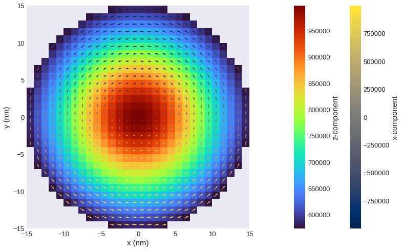
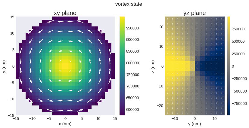
We can combine different plots in different subplots.
[52]:
fig, axs = plt.subplots(figsize=(12, 6), nrows=1, ncols=2)
plane_xy.z.mpl(ax=axs[0])
field.sel(z=10e-9).resample((10, 10)).mpl.vector(
    ax=axs[0], use_color=False, color="white"
)
plane_yz.mpl(
    ax=axs[1],
    scalar_kw={"colorbar_label": None, "cmap": "cividis", "symmetric_clim": True},
    vector_kw={"color": "white"},
)
axs[0].set_title("xy plane")
axs[1].set_title("yz plane")
fig.suptitle("vortex state", fontsize="xx-large")
fig.tight_layout()
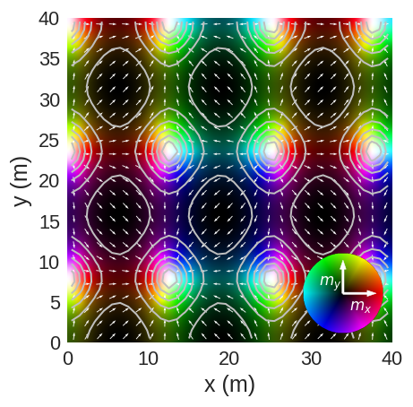
By exposing axes we can also combine the other plotting functions, e.g. lightness, vector and contour. We use a new field to show this functionality.
[53]:
import numpy as np


def init_m(p):
    x, y, z = p
    return np.sin(x / 4), np.cos(y / 5), z


mesh = df.Mesh(p1=(0, 0, -5), p2=(40, 40, 5), cell=(1, 1, 1))
field = df.Field(mesh, nvdim=3, value=init_m, norm=1)
[54]:
fig, ax = plt.subplots(dpi=120)
field.sel("z").mpl.lightness(
    ax=ax,
    interpolation="spline16",
    colorwheel_args=dict(width=0.75, height=0.75),
    colorwheel_xlabel=r"$m_x$",
    colorwheel_ylabel=r"$m_y$",
    # clim=(0, 1),
)
field.sel("z").resample(n=(25, 25)).mpl.vector(ax=ax, use_color=False, color="w")
field.sel("z").z.mpl.contour(
    ax=ax, levels=6, colors="#bfbfbf", colorbar=False, linewidths=1.2
)
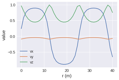
[55]:
# values at the top boundary
field.line(p1=(0, 40, 0), p2=(40, 40, 0), n=40).mpl()
[DEPRECATED] Interactive plots#
Note: We strongly recommend to use the new field.hvplot interface instead of the widgets-based approach demonstrated here. The documentation for hvplot can be found in a separate notebook.
We can create interactive plots based on Ipython Widgets. We define a new field to demonstrate the different interactive plots.
[56]:
p1 = (-5e-9, -5e-9, -2e-9)
p2 = (5e-9, 5e-9, 10e-9)
cell = (1e-9, 1e-9, 1e-9)
mesh = df.Mesh(p1=p1, p2=p2, cell=cell)


def value_fun(pos):
    return (pos[0], pos[1], pos[2])


def norm_fun(pos):
    x, y, z = pos
    if x**2 + y**2 < 5e-9**2:
        return 1
    else:
        return 0


field = df.Field(mesh, nvdim=3, value=value_fun, norm=norm_fun)
[57]:
field.sel("z").mpl()
[58]:
field.x.sel("z").mpl()
[59]:
field.x.sel(z=0).mpl()
NOTE:
Interactive plots cannot be displayed on the static website
Widgets work best in Jupyter notebook. Inside Jupyter lab, if the plot does not update correctly, try adding
plt.show()at the end of the function.
[60]:
# NBVAL_IGNORE_OUTPUT
@df.interact(z=field.mesh.slider("z"))
def myplot(z):
    field.x.sel(z=z).mpl()
[61]:
# NBVAL_IGNORE_OUTPUT
@df.interact(z=field.mesh.slider("z", continuous_update=False))
def myplot(z):
    field.x.sel(z=z).mpl()
[62]:
# NBVAL_IGNORE_OUTPUT
@df.interact(
    z=field.mesh.slider("z", continuous_update=False),
    component=field.mesh.axis_selector(),
)
def myplot(z, component):
    getattr(field, component).sel(z=z).mpl(figsize=(6, 6))
[63]:
# NBVAL_IGNORE_OUTPUT
@df.interact(
    z=field.mesh.slider("z", continuous_update=False),
    component=field.mesh.axis_selector(widget="radiobuttons", description="component"),
)
def myplot(z, component):
    getattr(field, component).sel(z=z).mpl(figsize=(6, 6))
[64]:
# NBVAL_IGNORE_OUTPUT
@df.interact(z=field.mesh.slider("z", continuous_update=False))
def myplot(z):
    field.sel(z=z).mpl(figsize=(6, 6))
Plotting field values along the line#
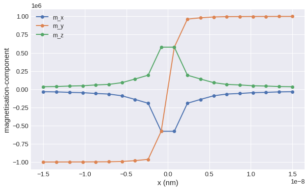
Sometimes it is necessary to explore the field values along a certain line. More precisely, to plot the field values along a line defined between two points. We again use the vortex field. Firstly, we need to obtain \(z\) values of the field on a line between \((-15\,\mathrm{nm}, 0, 0)\) and \((15\,\mathrm{nm}, 0, 0)\) at \(n=20\) points.
[65]:
line = vortex_field.mesh.line(p1=(-15e-9, 0, 0), p2=(15e-9, 0, 0), n=20)
field_values = []
parameter = []
for point in line:
    x, y, z = point
    parameter.append(x)
    field_values.append(vortex_field(point))

mx, my, mz = zip(*field_values)
Now, we can plot the field values along the line:
[66]:
plt.figure(figsize=(10, 6))
plt.plot(parameter, mx, "o-", linewidth=2, label="m_x")
plt.plot(parameter, my, "o-", linewidth=2, label="m_y")
plt.plot(parameter, mz, "o-", linewidth=2, label="m_z")
plt.xlabel("x (nm)")
plt.ylabel("magnetisation-component")
plt.grid()
plt.legend()
[66]:
<matplotlib.legend.Legend at 0x7f5f3116ef70>